⁂
On the origins and wide spread
of Zeitungs-Grotesk and Fette
Kursiv-Grotesk between 1875–1960
Ongoing research on the origins of the stout extrabold sans ‘Zeitungs-Grotesk’ that was especially popular in avant-garde magazines in the years 1914 – 1930. In my research I am trying to establish a timeline of different foundries publishing this typeface in slightly differering versions as well as possible ancestors and successors. Furthermore I am documenting prominent graphic design examples using the typeface in both Europe and the Soviet Union.
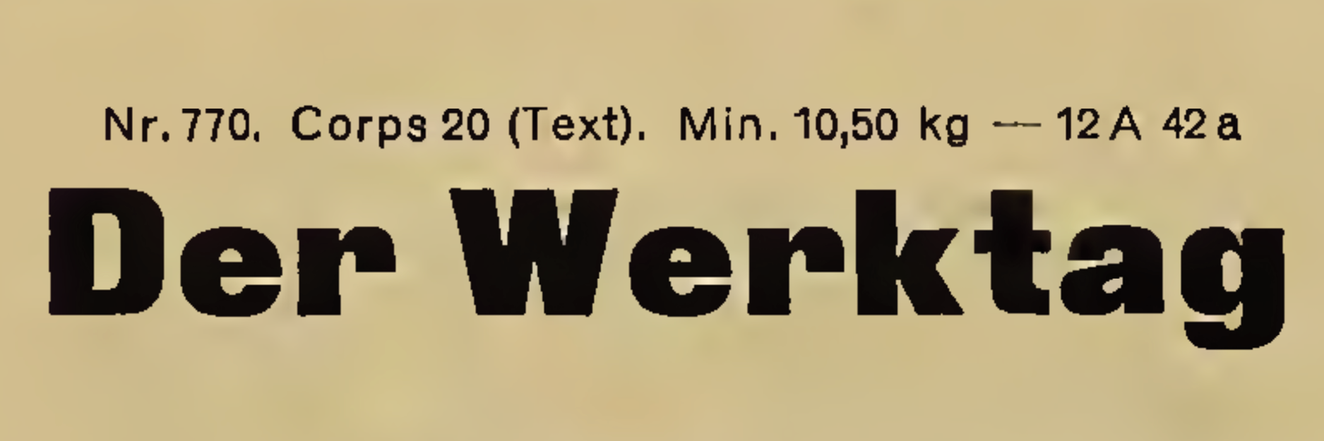
[Above] A sample of ‘Fette Grotesk’ by the Bauer Type Foundry / Bauersche Gießerei in 1900. Image source: Hauptprobe in gedrängter form der Bauerschen Giesserei, Frankfurt am Main: Filialen in Barcelona und Madrid, A. Numrich & Co. in Leipzig, p. 109.
⁂
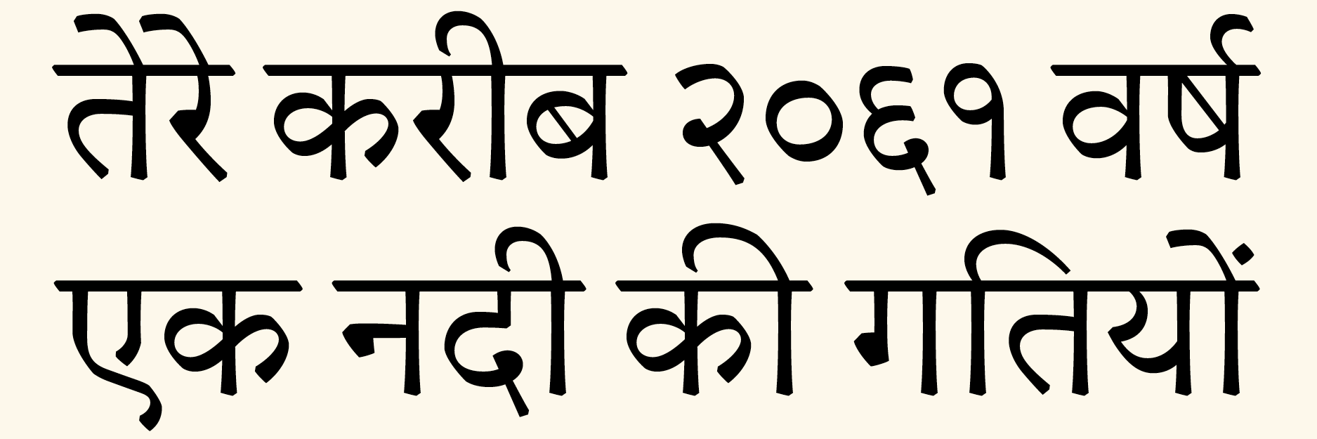
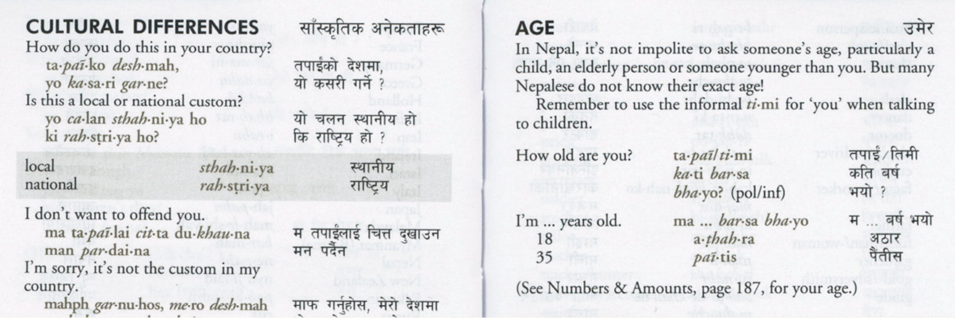
Typographic practice in Devanagari.
Past limitations, present practice
and future directions.
Project type
MA Dissertation,
University of Reading
Writing year
2013
Word count
11.500 words
Related work
Throughout the history of Devanagari typography technological limitations repeatedly had a profound impact on the graphic representation of the script. Difficulties in rendering the script accurately resulted in the focus primarily being directed at the adaptation of the writing system for new typesetting equipment. Consequently, less thought was given to the actual use of typefaces, which thus impaired the quality of vernacular typography.
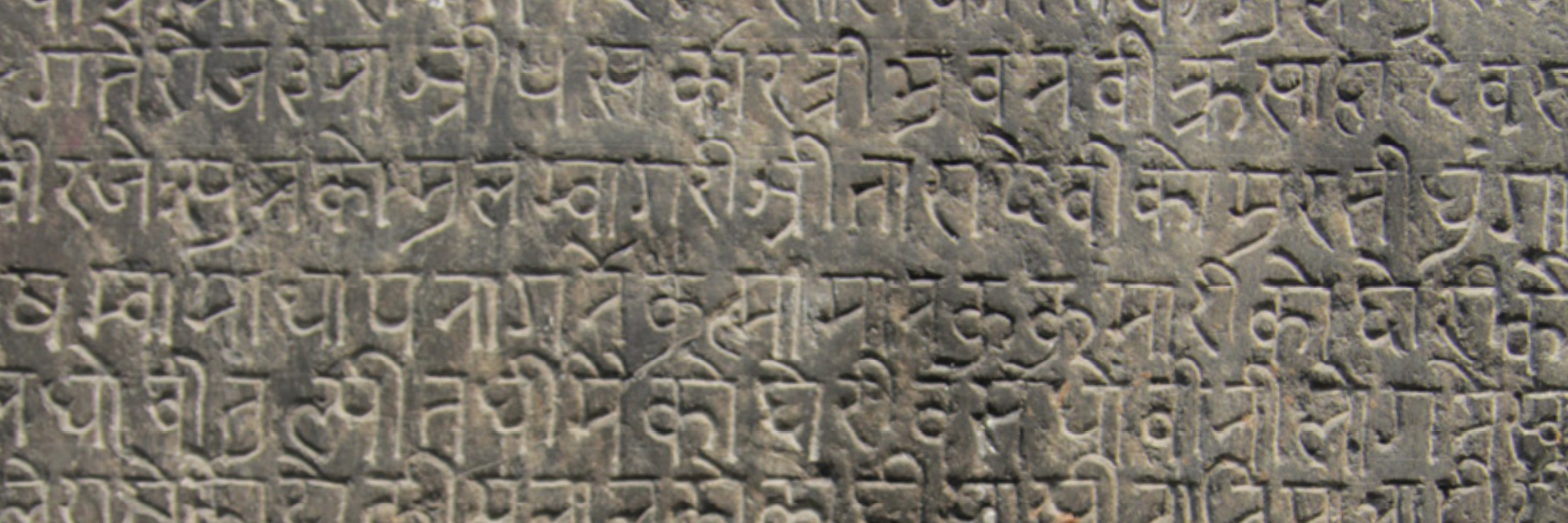
[Above] Devanagari inscription in Kathmandu, Nepal (no date). Photograph from my research trip to Kathmandu in 2013.
Ever since the introduction of the PostScript format and the Unicode character-encoding standard, the majority of former limitations is obsolete. While this should have acted as an incentive to reevaluate typographic practices, contemporary publications continue to adopt practices dictated by former technological constraints. Moreover, the default settings of desktop publishing software are not questioned and thus gradually enforce typographic behaviour in which the computer takes over design decisions. In effect, the tremendous potential provided by present-day technology, is not being utilised – resulting in considerable detriment to typography. This dissertation analyses and evaluates current typographic practice in Devanagari on the basis of text-intensive documents from the last 20 years. It takes into account the implications of technological limitations, investigates the present typographic palette and proposes opportunities for innovation.
⁂
How to approach the design of
a multi-script typeface family
Project type
Research paper,
University of Reading
Writing year
2013
Word count
2.000 words
related work
The scope of this report is addressing the question how to approach the design of a text-typeface for a foreign script without being a native reader of a language using that particular script. Although the focus lies on the Devanagari script the content is kept general and the methodology learned may prove to be helpful in approaching other world scripts which are undertaken by non-native designers.
[Above] A spread from a Nepali phrasebook, showing the typographically rich content. It exemplifies the typical mix of very different typefaces in multilingual publications and lack of differentiation for Devanagari, using only a single weight compared to the Latin with regular, bold, italic in serif or sans-serif.
⁂
The echo of architecture in Danish type design of the 20th century.
What are the roots of the unique Danish design phenomenon, and what made it last?
Project type
BA dissertation,
Middlesex University
Writing year
2011 – 2012
Word count
7.500 words
related work
Living and working as a designer in Denmark, I was often confronted with Danish architecture-inspired design. Whether it is product, furniture or graphic design; the influence of architecture is highly visible today – a design that Denmark is world-renowed for: clean and simple while still incorporating some traditional influences. With my personal experiences in Denmark I decided to further investigate the unique and strong link between architecture and type design – a connection that has influenced many design disciplines until today and is considered a Danish ‘national style’. While the form, with “a sturdy character that is noticable without being distracting” (Middendorp 2006), is highly inspired by architectural lettering, it is especially the ideology of a clear‑cut functionalist and user‑centered concept, that can be linked to the architectural discipline.
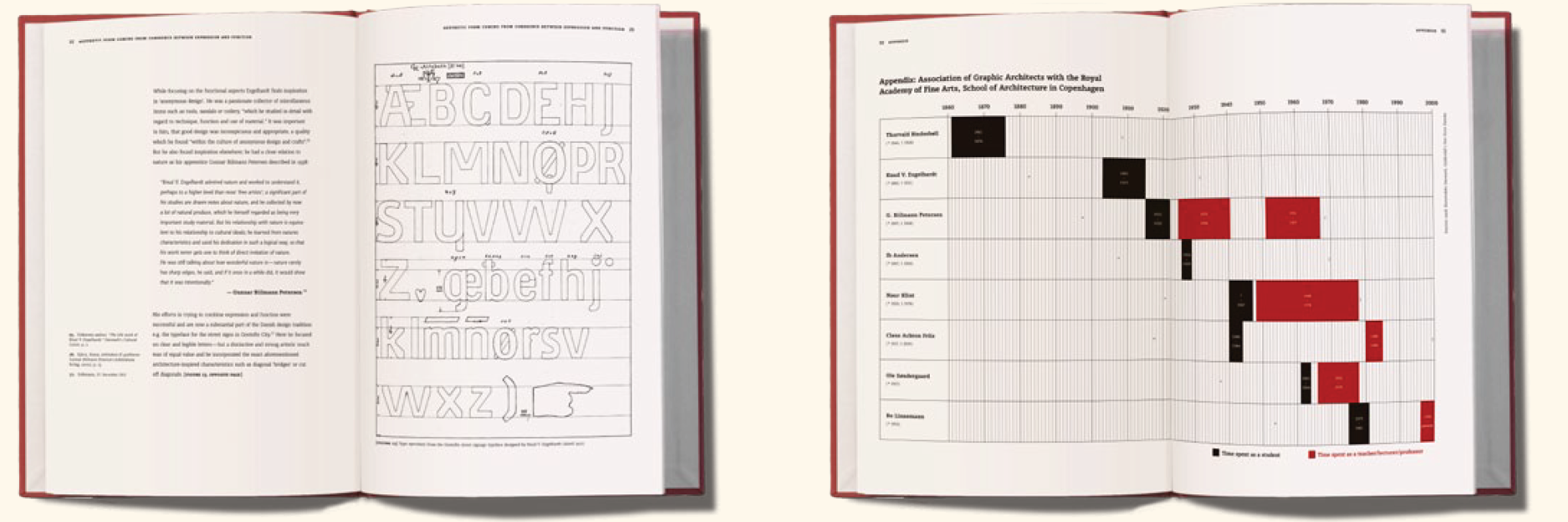
[Above] Spreads from the printed dissertation book. Left: type specimen from the Gentofte street signage typeface designed by Knud V. Engelhardt (dated 1912). Right: Infographic about the association of various Danish graphic architects with the Royal Academy of Fine Arts, School of Architecture in Copenhagen.
The aim of this dissertation is to discover the roots of this truly unique Danish design phenomenon as well as the reasons for its longevity beyond the 20th century.
View other projects