Blok
Blok
Styles
1 weight
(more in development)
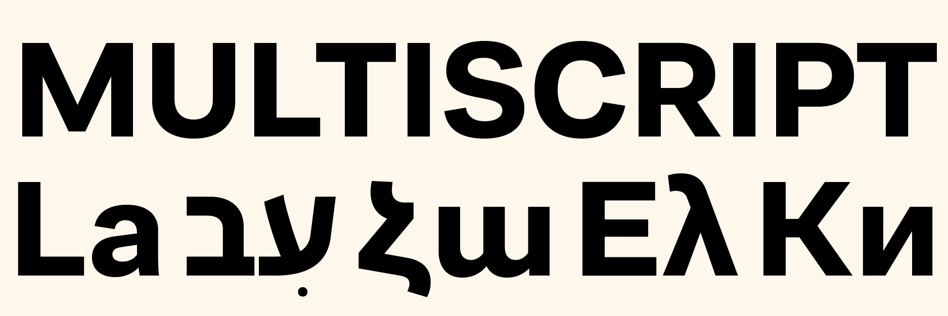
supported scripts
Latin
Design year
2017–present
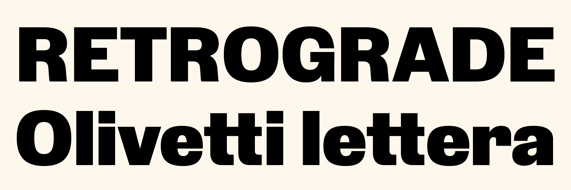
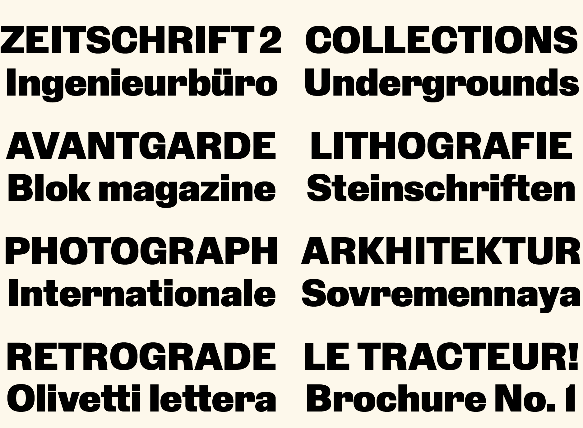
Blok is a personal interpretation of an older squarish sans which was popular in early 20th century Avant-garde magazines in Europe and the Soviet Union. From the 1950s and onwards this typeface has also been used much in Olivetti advertising material (and likely served as a basis for the 1947 and 1960 Olivetti logos).
In my design I tried to distill the spirit of the various original metal type designs coming from many different type foundries between ca. 1887–1912 (according to my research, starting with ‘Fette Steinschrift’ by Schelter & Giesecke). To make the typeface more useful for contemporary use I am currently in the process of developing further styles.
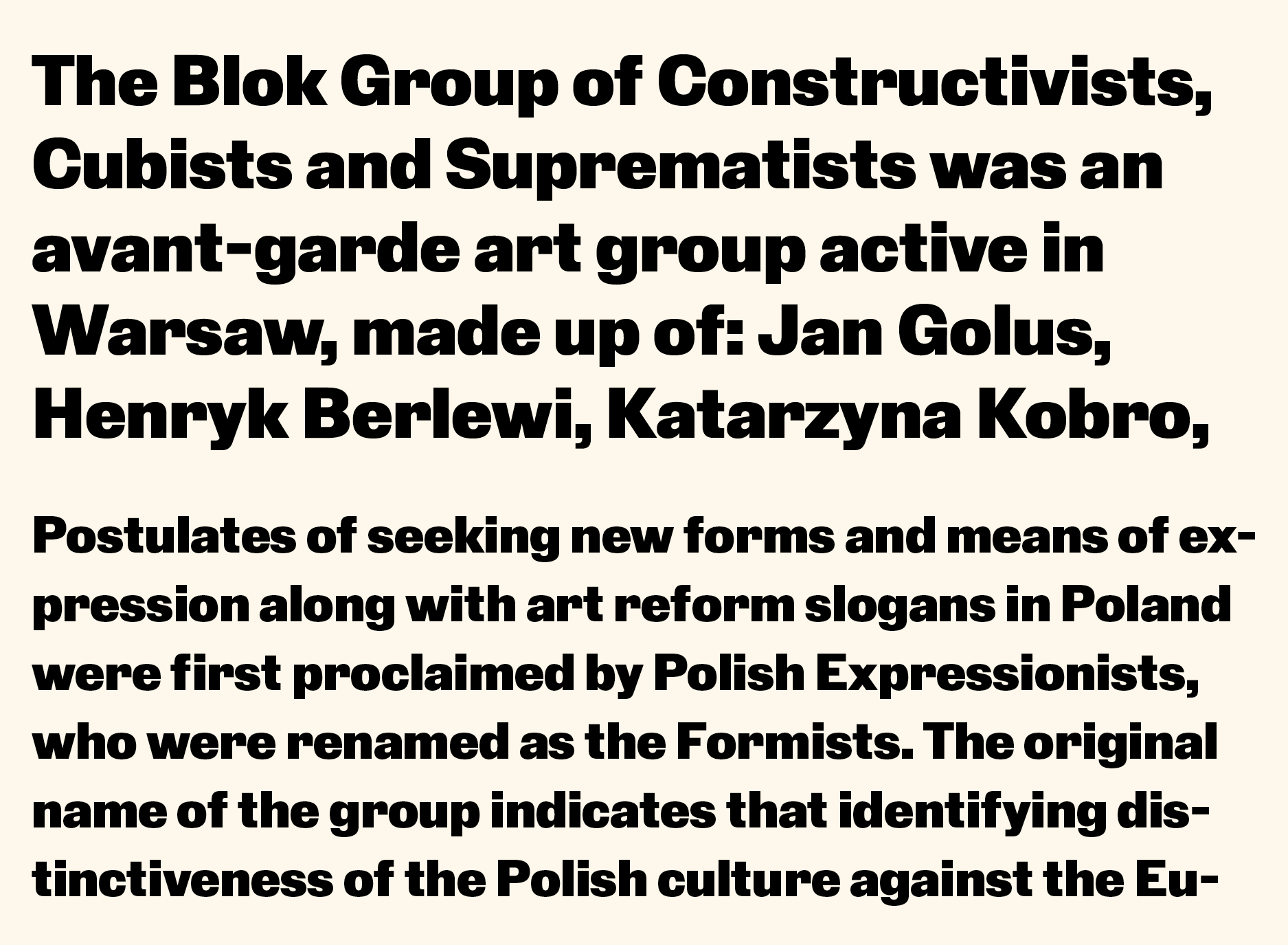
The working title is Blok after the Warsaw Blok group and magazine from ca. 1924 (which is where I first spotted this typeface in use).
View other projects